Charcoal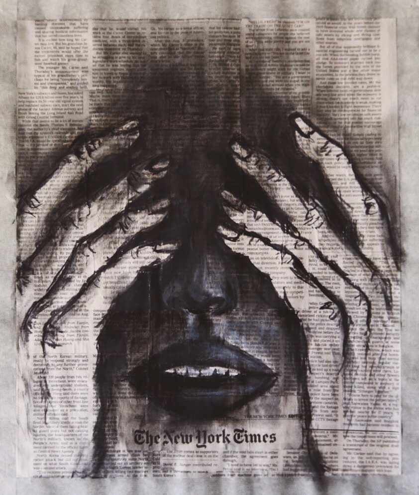
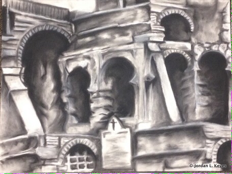
Originally I had no idea what photo I had wanted to use for this project. Before I chose my final piece my first picture was simple, overdone, and something that I had kind of already completed with my practice drawing. So I got to thinking that if I had to choose a photo that meant a lot to mean then I would choose a place where I would love to travel. My first thought would be the Eiffel tower in France, but then I said "No that's to overused" and plus it would have been very difficult to add details with vine charcoal. In the end I went with a picture of the Roman Coliseum zoomed in to a specific spot. The reason being is because it would shine in a different light than other coliseum drawings, and I Have always wanted to travel all across Europe.
I was very pleased with the outcome in the end, and how the really dark areas contrasted with the lighter stone. I was also very proud with how I was able to distribute the light and dark across the surface due to the "3-D" photo. The way that I was able to use black and white charcoal to create a 3-D effect and make it look like the arches actually led somewhere was by far my favorite thing about this piece. I was able to turn a flat piece of paper into a black and white, dimensional drawing. Some of the challenges that I had to overcome was the proportion of all the shapes (buildings), the darkness inside the arches, and all the tiny details that I had to create with vine charcoal and make it look as realistic as possible. If I did this project again i would do more practice drawings so I could get a better feel of how to correctly proportion everything. I would also plan more of where to put the dark and light shades so I can make it look even more real. I was able to grow as a person during this project because I can now fully understand the distribution of light and dark shades. It will help me grow in the future with my other charcoal and pencil drawings. This drawing was out of my comfort zone when I chose architecture but it is by far the best charcoal drawing I've ever done. 
Ink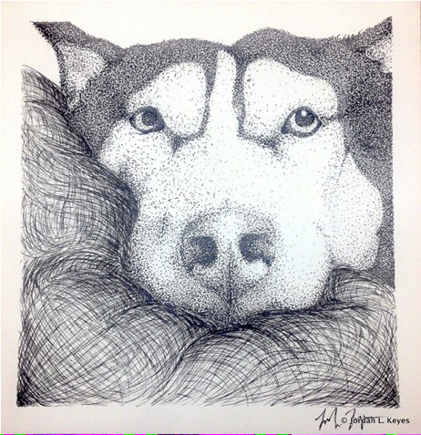
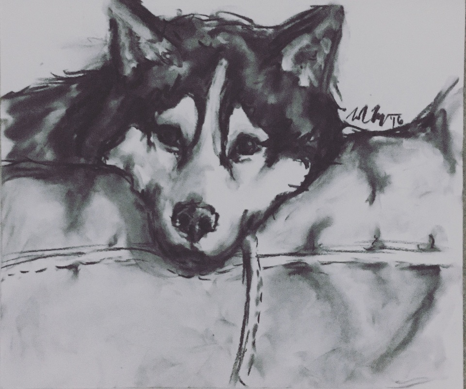
For this project we had to do something that had intrinsic value to us. I wanted to do something related to books, music or even a pair of Converse. Not to be cliche, but I had to go with my dog Nala. I scrolled through my endless amount of pictures and ended up with one that best represented her personality.
My favorite part of this project is the fact that its ink. I love the texture it shows and it reminds me of old fashion writing. I also love how I could create shading with stippling. It makes the picture detailed with a lot of depth. If I could redo this project I would make the side left of the nose darker. Because it's a shadowed area it should be darker than the other side, but because its white fur, it should be lighter than the black fur. I would also move the nose higher up on the face to accomplish the "squished" look. I grew as a person in this project by learning patience. I usually finish my art projects fairly quickly, but when you're using stippling as a technique. I also learned that when it comes to my own artwork, I should do what I think will look right. 
Oil Pastel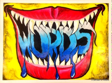
As soon as my teacher had given us the rules or the outline for this project I immediately knew what I wanted to accomplish. The idea that I wanted to express was how difficult it is to speak out against something. The teeth had represented the barrier between what you are going to say and actually saying it. The blue words represents the heartache someone feels if they can't express themselves.
I was relatively pleased with the overall outcome of the piece. The colors had made the graffiti like images pop. While the scary reds, and the dark blues represented the distress someone can feel. My favorite part of this had to be how everything blends together so we'll and create a comic book feel. And comic books vs graffiti aren't always that different imagery wise. I also loved how ironic the word "words" was. I had many challenges during this protect because I am a person that focuses mainly on black and white drawing like charcoal. I had to step out of my comfort zone and use, many bright, different colors. I also was not used to how oily the pastels where and the way they blended. I wanted to make sure my final was blended well by doing a lot of practice drawings. Overall it was something I'm not used to but the outcome was very pleasant I did a lot of growing as an artist during this project. I learned about how to use colors correctly, which ones that blend well and others that contrast well. The biggest reason is because during this process I had learned a new media and I can understand color better so I'm able to apply it to my other work. |
Graphite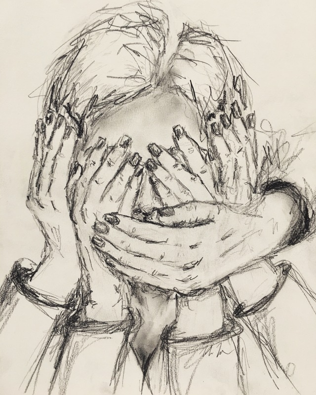
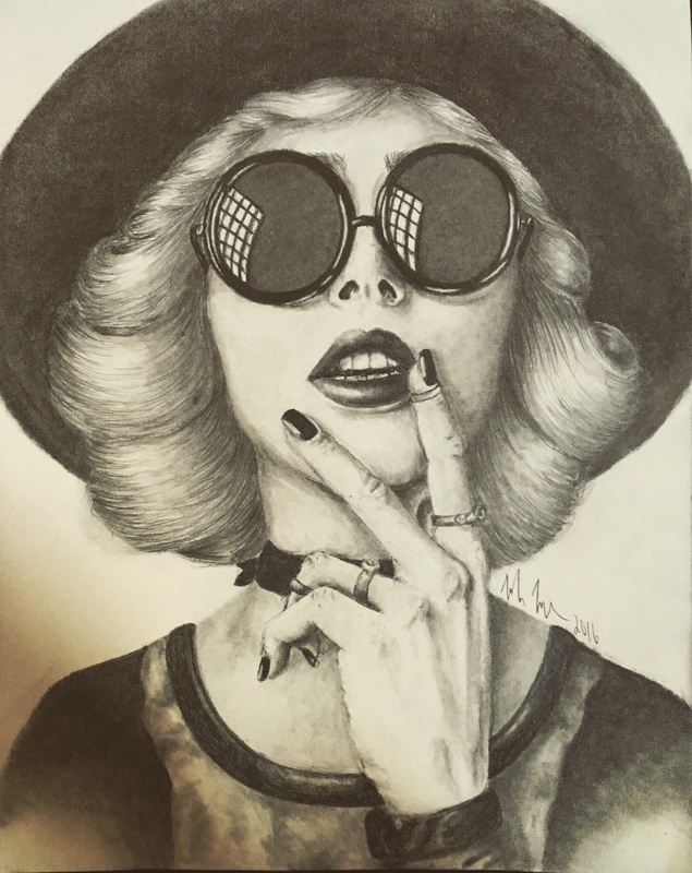
I had drawn two different pictures for this project. First I drew my friend Isabelle which was a close up drawing of just her fave and hair. My second drawing was of a classmate. I choose this one because it was better executed and it showed more than just the face. I had taken this picture on a whim because the positioning of it was perfect. This picture was able to give me a challenge.
My favorite part of this drawing is her hands. They were the most difficult to make them look like hands but they turned out amazing. I also really loved the hair because I usually can't draw hair I was very happy with how it turned out. If i was able to redo this picture I would fix all the little mistakes in the face before I did anything else, and I would also take time to think out the background more. I felt like I just threw it in there so I had a background when I could've did something with more detail but overall fit in with the "professional" photo. I grew as a person in this project because I realize how much proportion can change hings. With the grid drawings it was immensely easier to get the face and features on point. Before I had taken this class I had no sense of proportion and how it effected my drawings. After doing the grid on more than one portrait, I enjoy using the grids because it makes the drawing look even more realistic. Color Pencil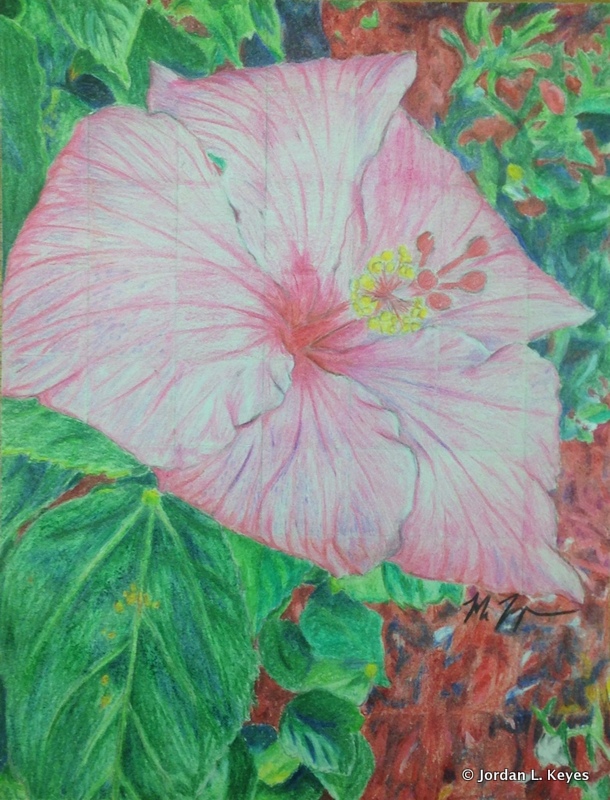
When we were first given this project I had absolutely no idea what I wanted to do. I mostly had pictures of people or animals. Even though it was cliché, I went with a flower because I wanted the color to be the most prominent. Not to mention I wanted to have an opportunity to work with color. I usually draw in only black and white. So I chose a flower that I took a picture from outside my moms house.
I love the shading in the petals and how realistic and proportional the picture is. I found it very difficult to find colors for this specific drawing because they were unique and I wanted to get really close to the original picture. The biggest thing I like is the actual flower but I did enjoy drawing the big leaves. If I were to redo this picture I would make the "mulch" (background) a different color because it didn't turn out how I wanted it to. I also would make sure I draw my grid lines a lot lighter because the flower being so light, you can see the grid lines. Overall I felt as if the picture turned out quite well. I grew as an artist in this project because I was shoved out of my comfort zone. I usually never work with color and it being a colored pencil project I had no choice. I was able to grow by learning how to mix and blend colors to make them picturesque. I may do more colored pencil drawings in the future but for now I'll stick with black and white. |
